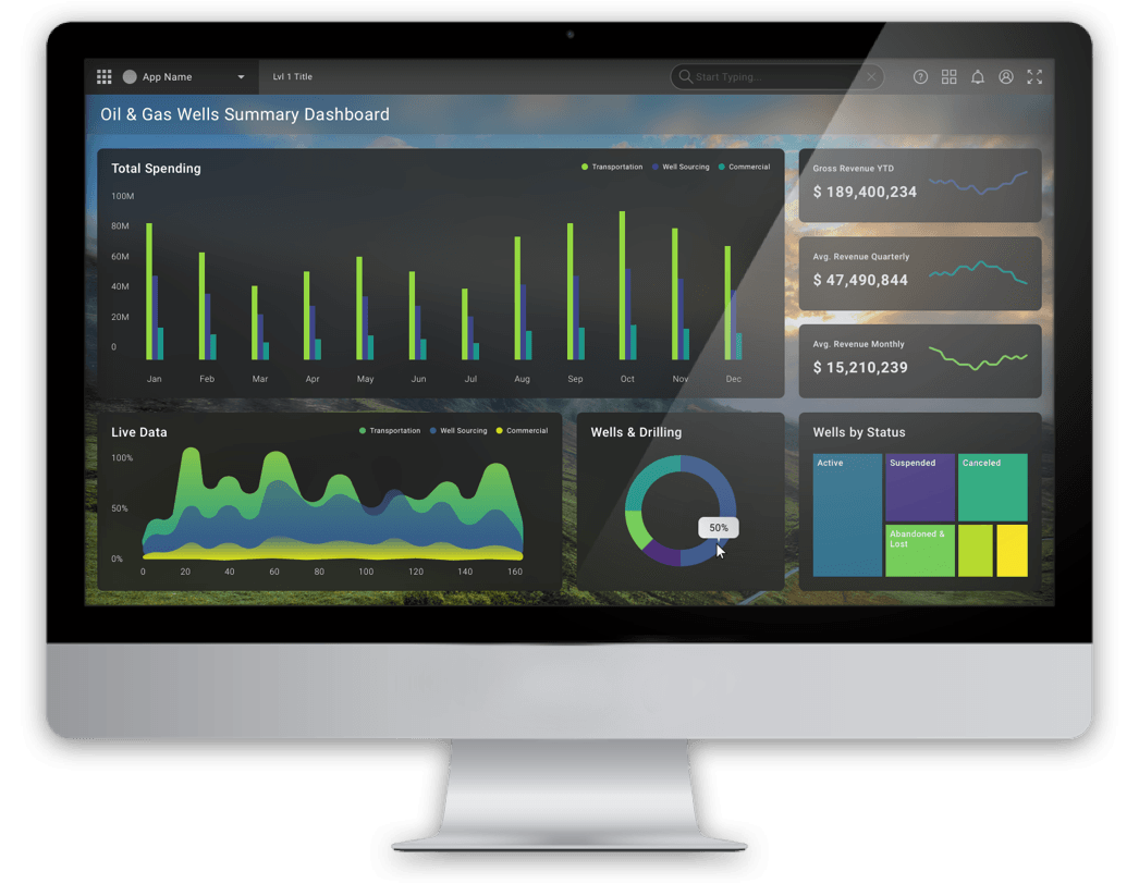

A dashboard example using components and visualizations from the design language system that I worked on.
Skills: UI Web Design, Data Visualization, Design Language System Maintenance
Tools: Sketch, InVision, Abstract, Figma
Timeframe: 6 Months
*Logo and company name changed to protect client confidentiality
A dashboard using components from the design language system that I have been responsible for maintaining and updating to new design standards. The visualizations and components shown are some examples that designers can use for their apps in the oil and gas industry.
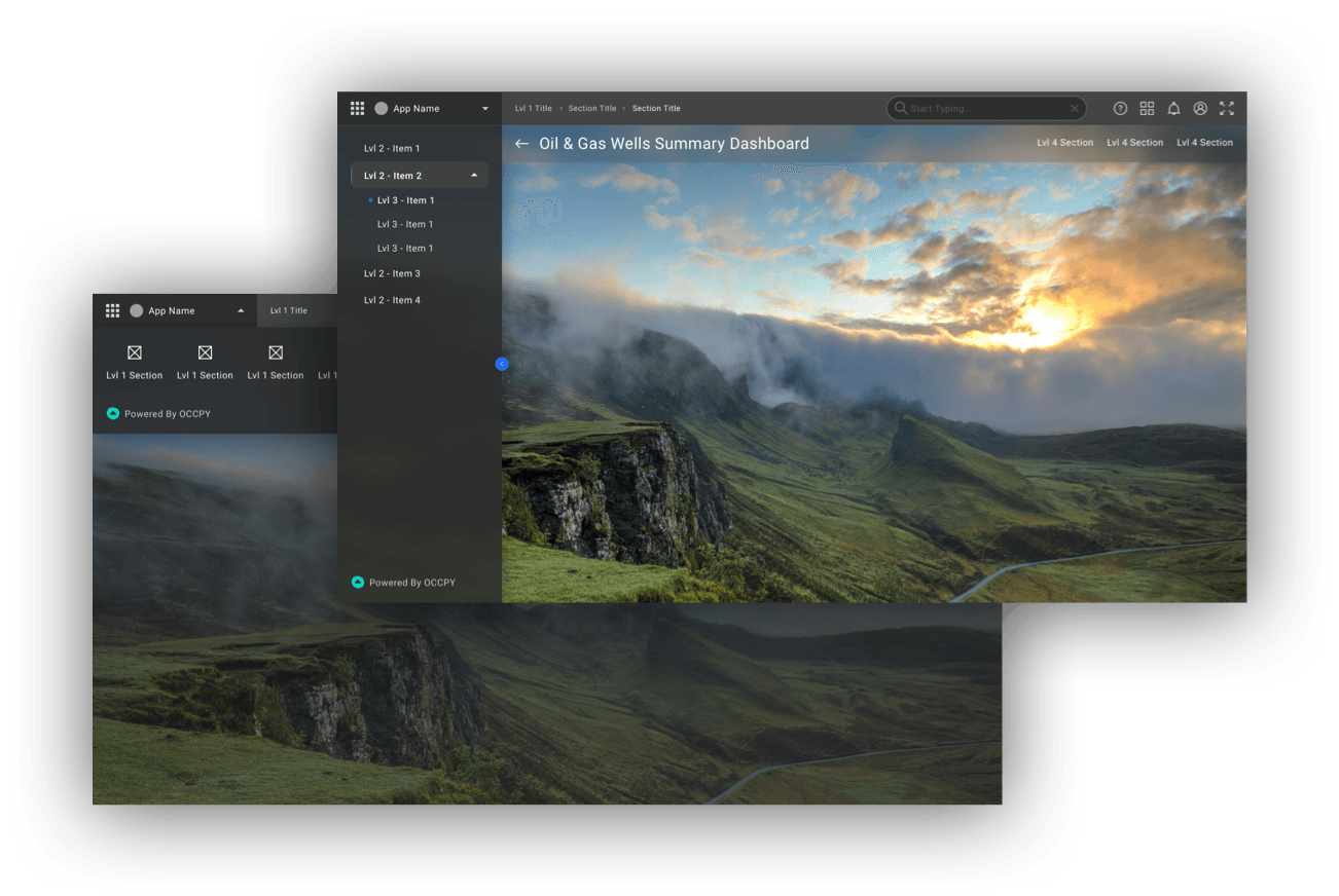
The Look & Feel
The interface features a dynamic customizable photo background and uses glassmorphism to establish a visual hierarchy and depth of the interface.
Accessible Visualization Colors
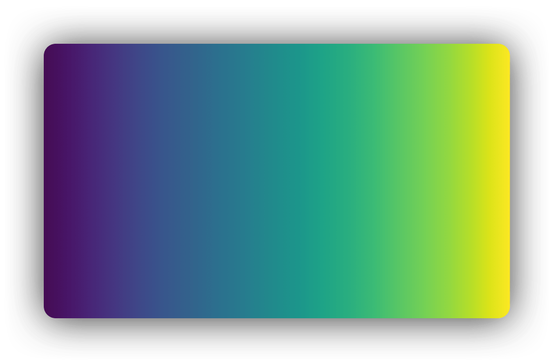
The colors being used in visualizations are part of a Viridus color palette. This is a color palette focused on blues and yellows in order to increase readability for colorblind individuals.
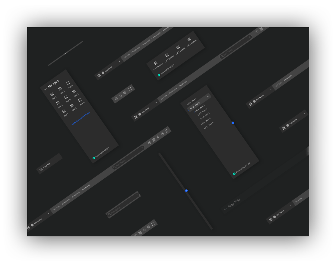
Everything designers will need for their navigation framework
We have a library full of hundreds of components in the design language system. Shown here are the components needed for designers to construct the navigation framework for their apps. Designers have options to use multiple levels of navigation along with immersive mode to help save screen real estate.