

A financial analytics dashboard to view company data, insights, and movements.
Skills: UI Web Design, Prototyping, Data Visualization
Tools: Sketch, InVision
Timeframe: 2 Weeks
*Logo and company name changed to protect client confidentiality
Home Page
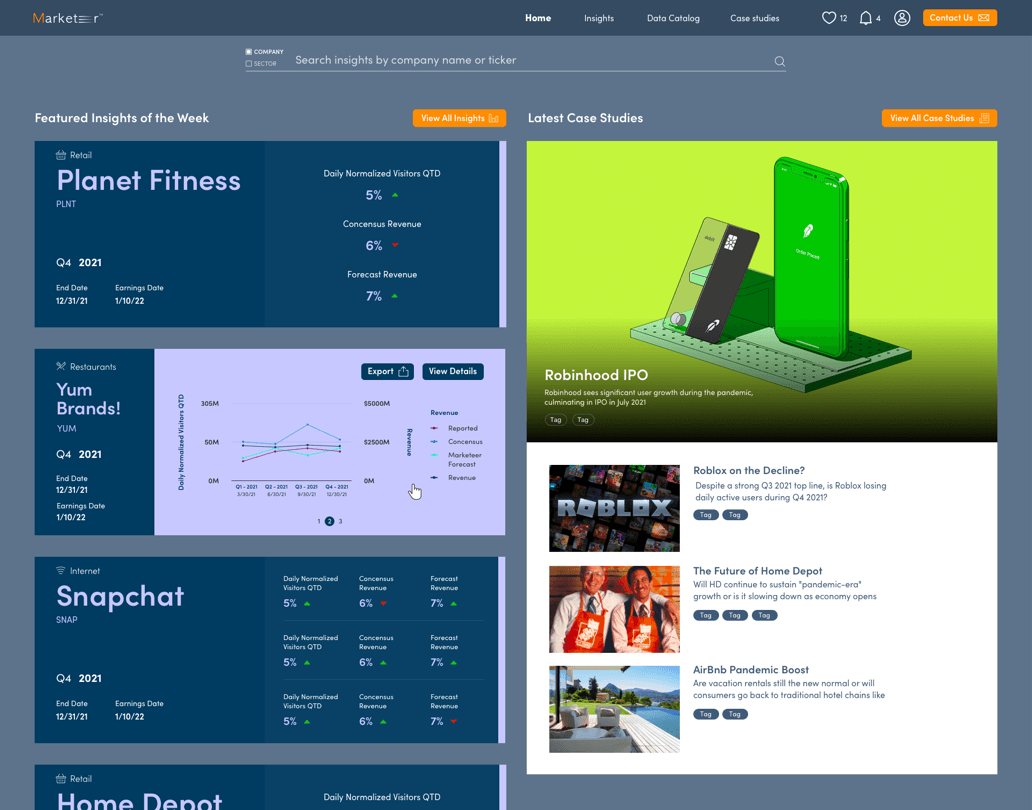
Features a search bar for easy access, featured insights of the week, and the latest case studies. All the items a user would need to see first with the option of clicking to see a more in depth view.
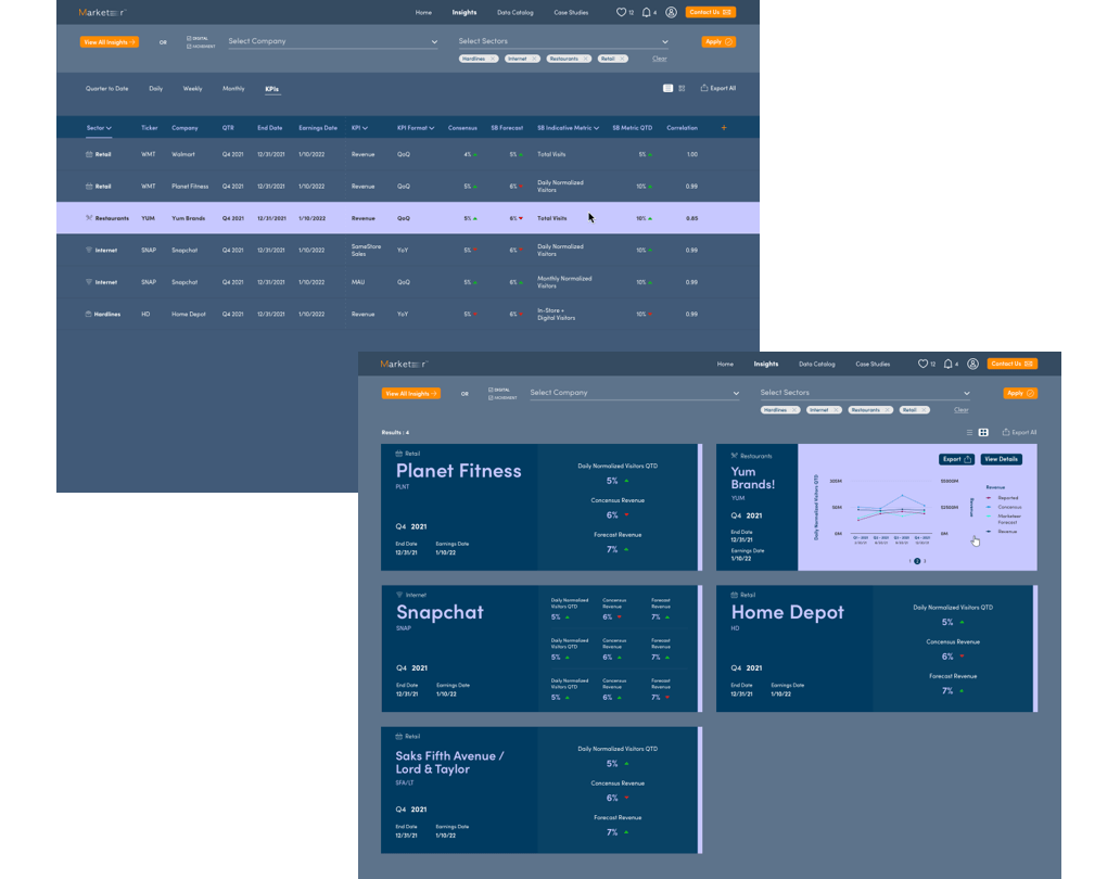
Card & List views for Insights
Allows users to customize how they view complex information. Cards have a rollover to show a graph for those who are more visual. List view feels like a standard Excel sheet for easy readability.
More in Depth Views of Data
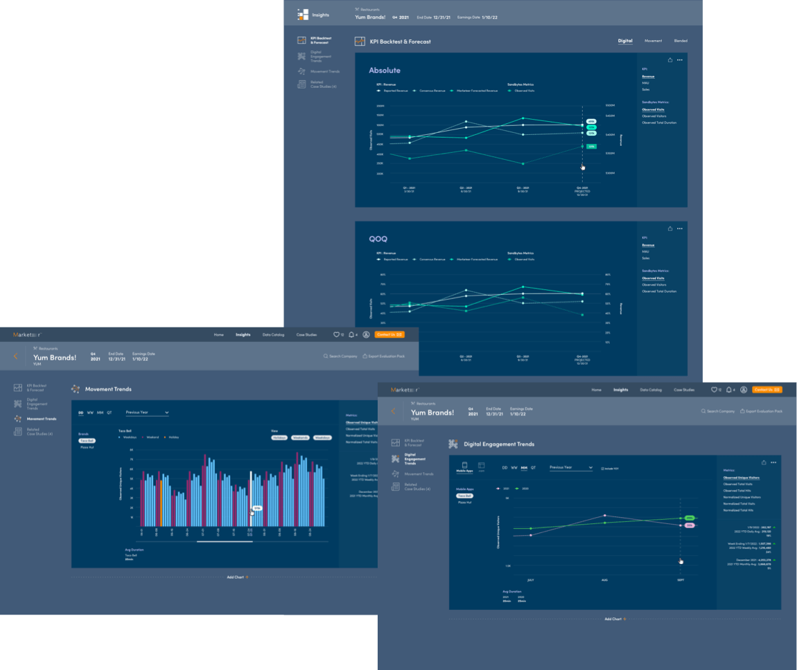
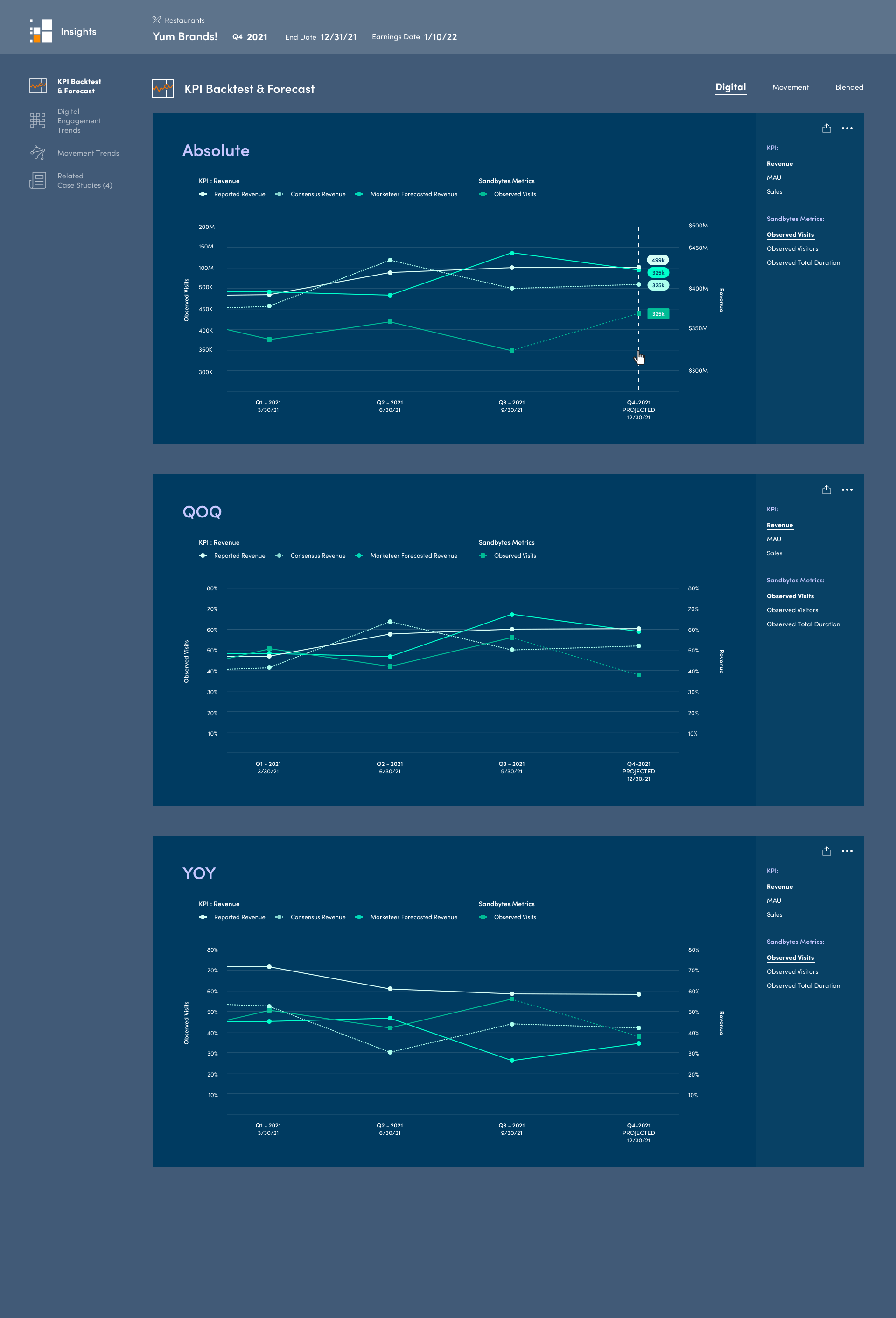
Users have the option to click into brands on the Insights page to view data specific data to that company. The colors used on the graphs were intended to make certain information stand out and enhance the user experience of the application.
Case Studies
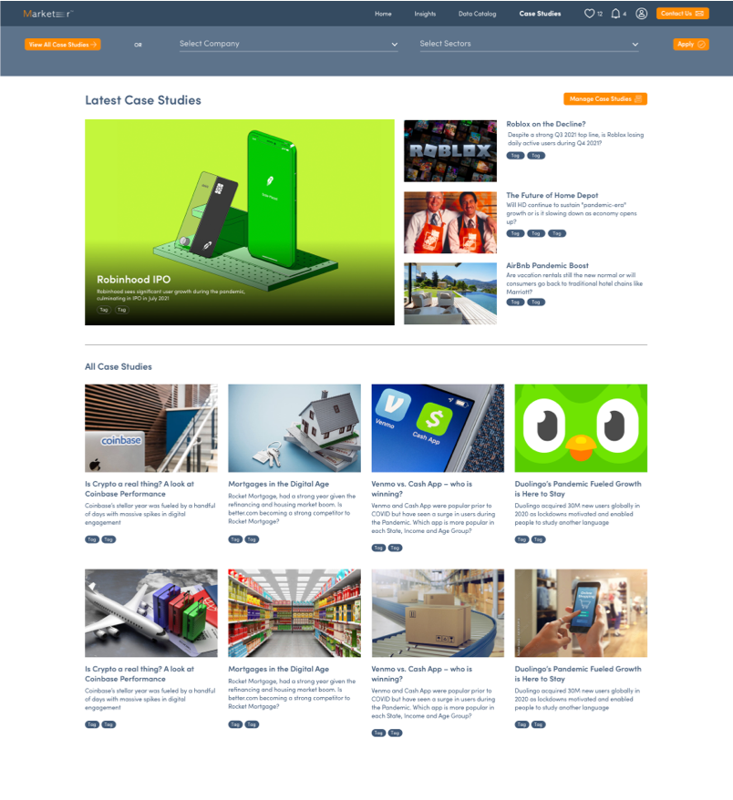
The Case Studies page was designed to look like a standard news or article site for familiarity. A black gradient treatment is applied to the featured article to increase accessibility. The search bar is applied for quick searches that interest the user, and tags are used to help users quickly view topics without having to read every title and description.
Color Coded Sections
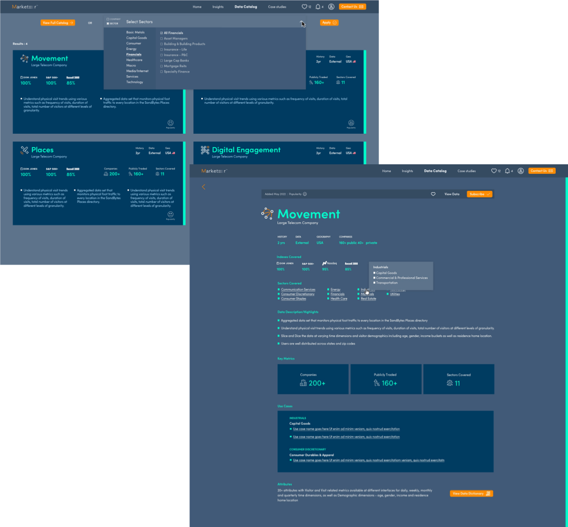
All screens associated with the Data Catalog use this bright teal color to indicate a difference from the Insights pages, which use lilac. We chose to color code the sections to help users understand when they are in a different section on the site being that there are so many cards and graphs.

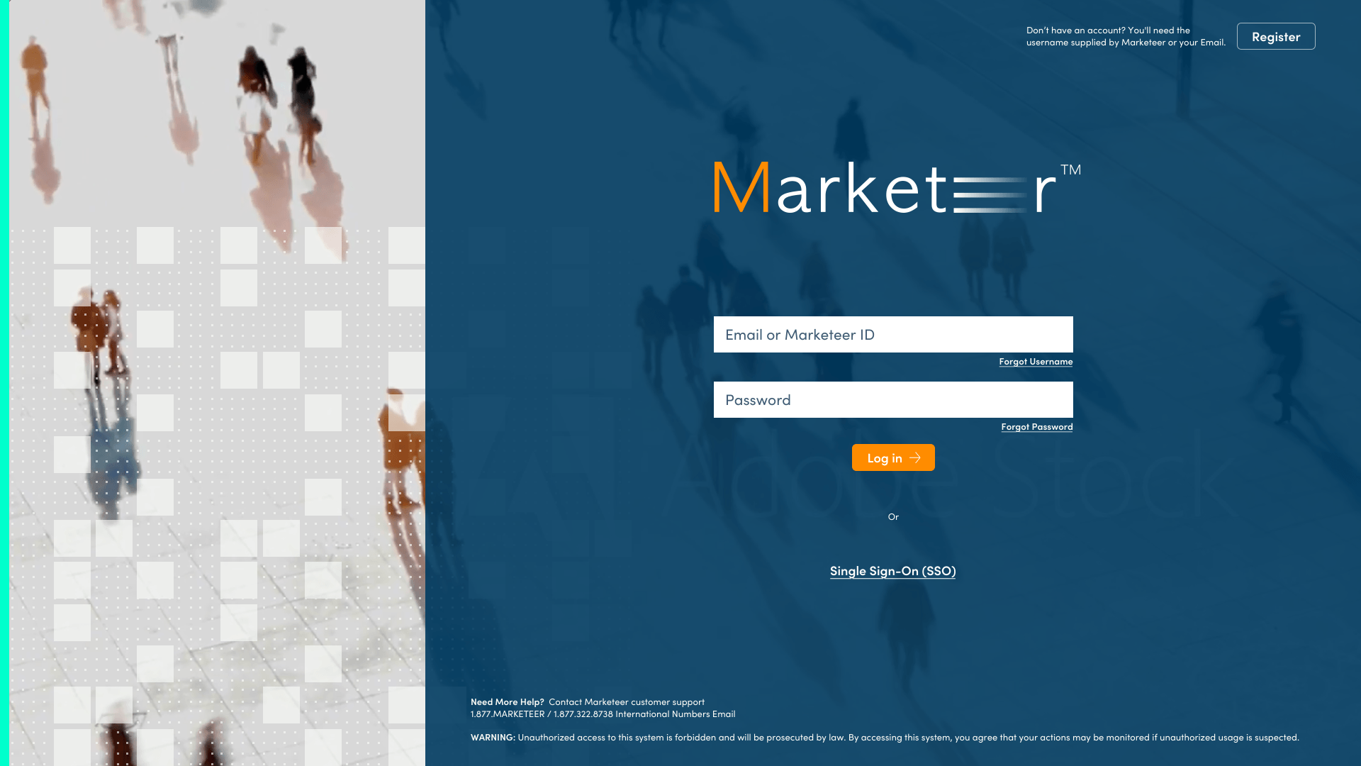
Log In Page
We went with a fresh and sophisticated look and feel for the Log In page. the backround is a moving gif showing people walking from a bird’s-eye view. This was to accentuate that Marketeer is an app made for everyone to use.
A Peak Into the Designs
Slide title
Write your caption hereButton
Slide title
Write your caption hereButton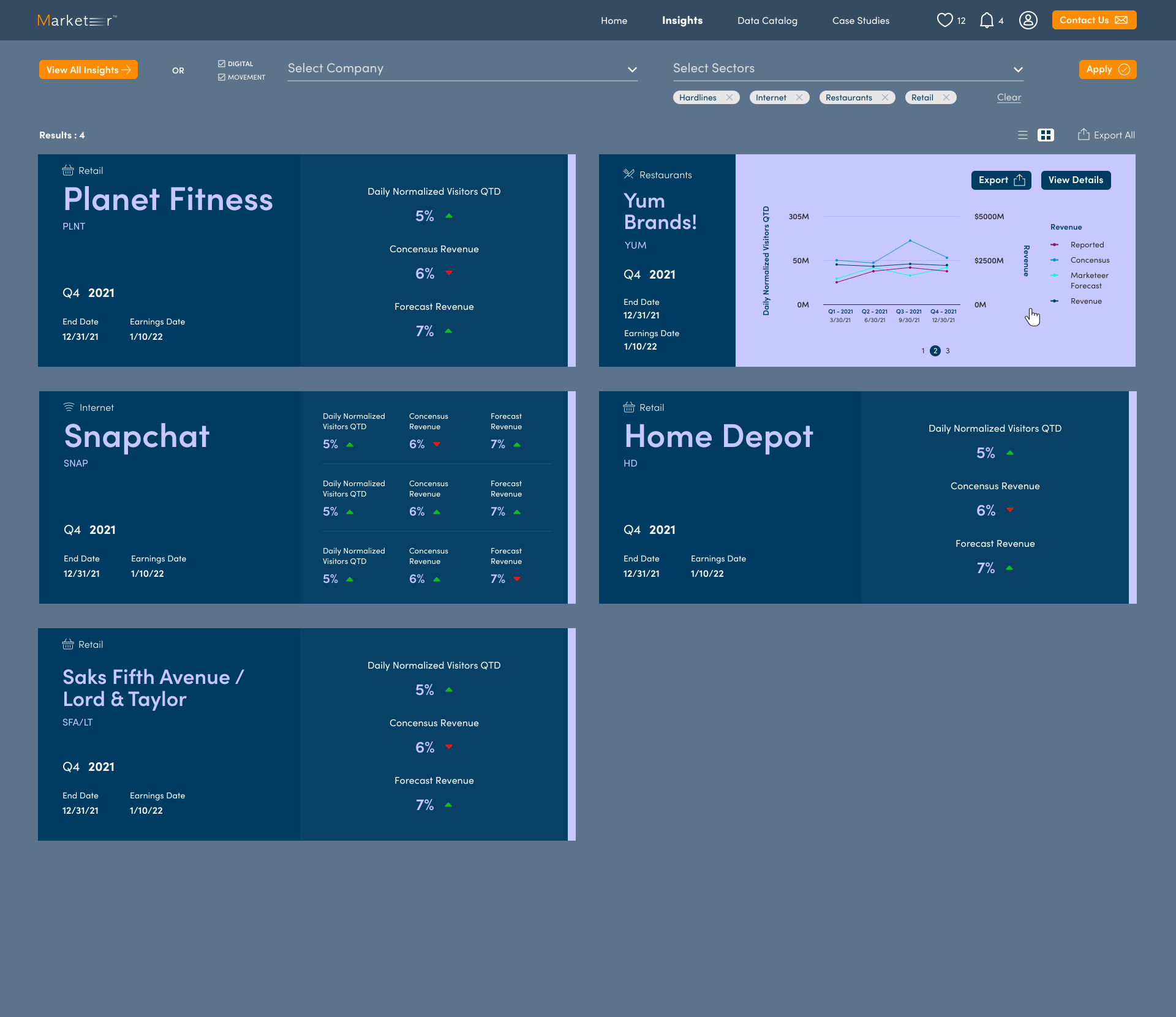
Slide title
Write your caption hereButton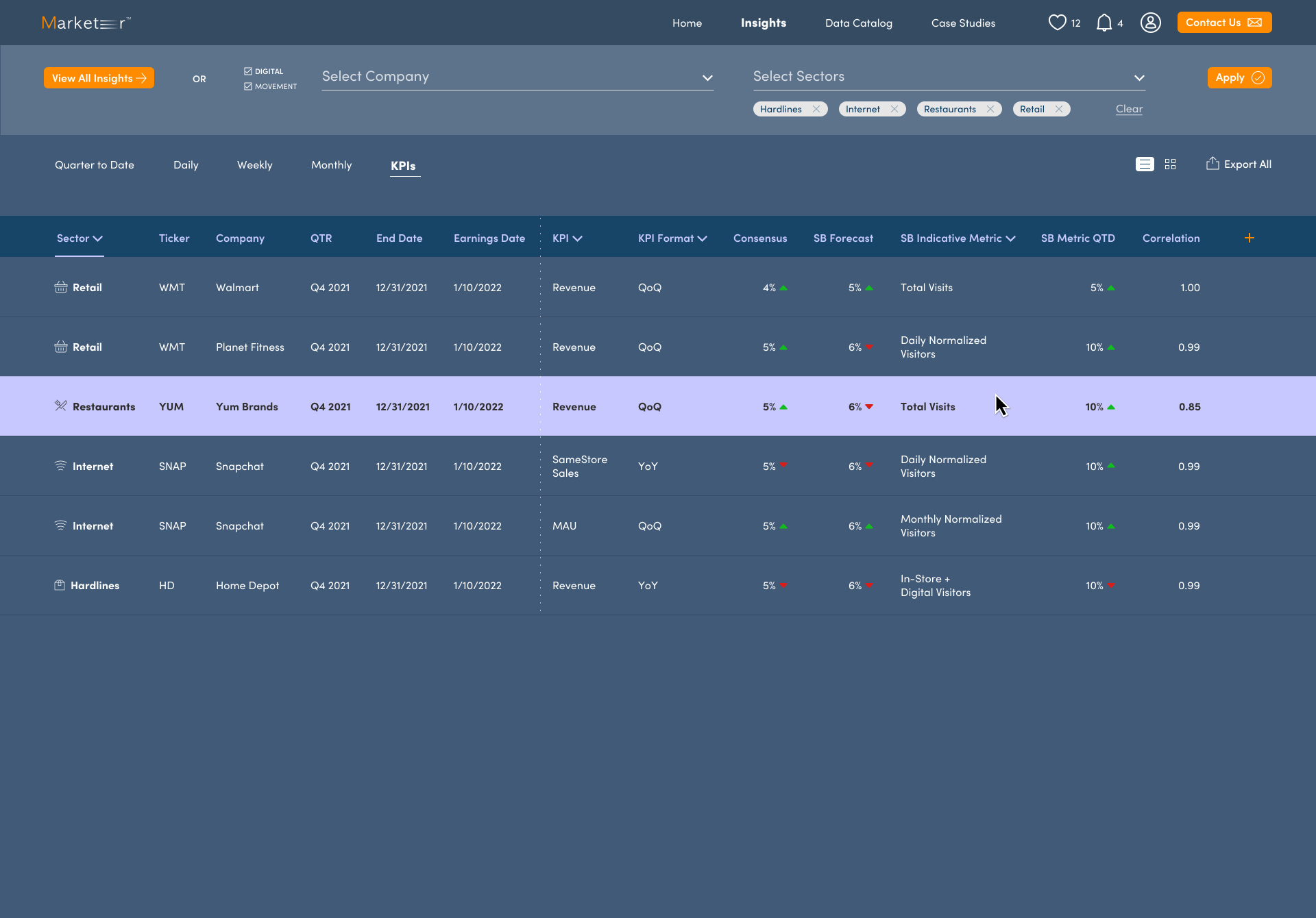
Slide title
Write your caption hereButton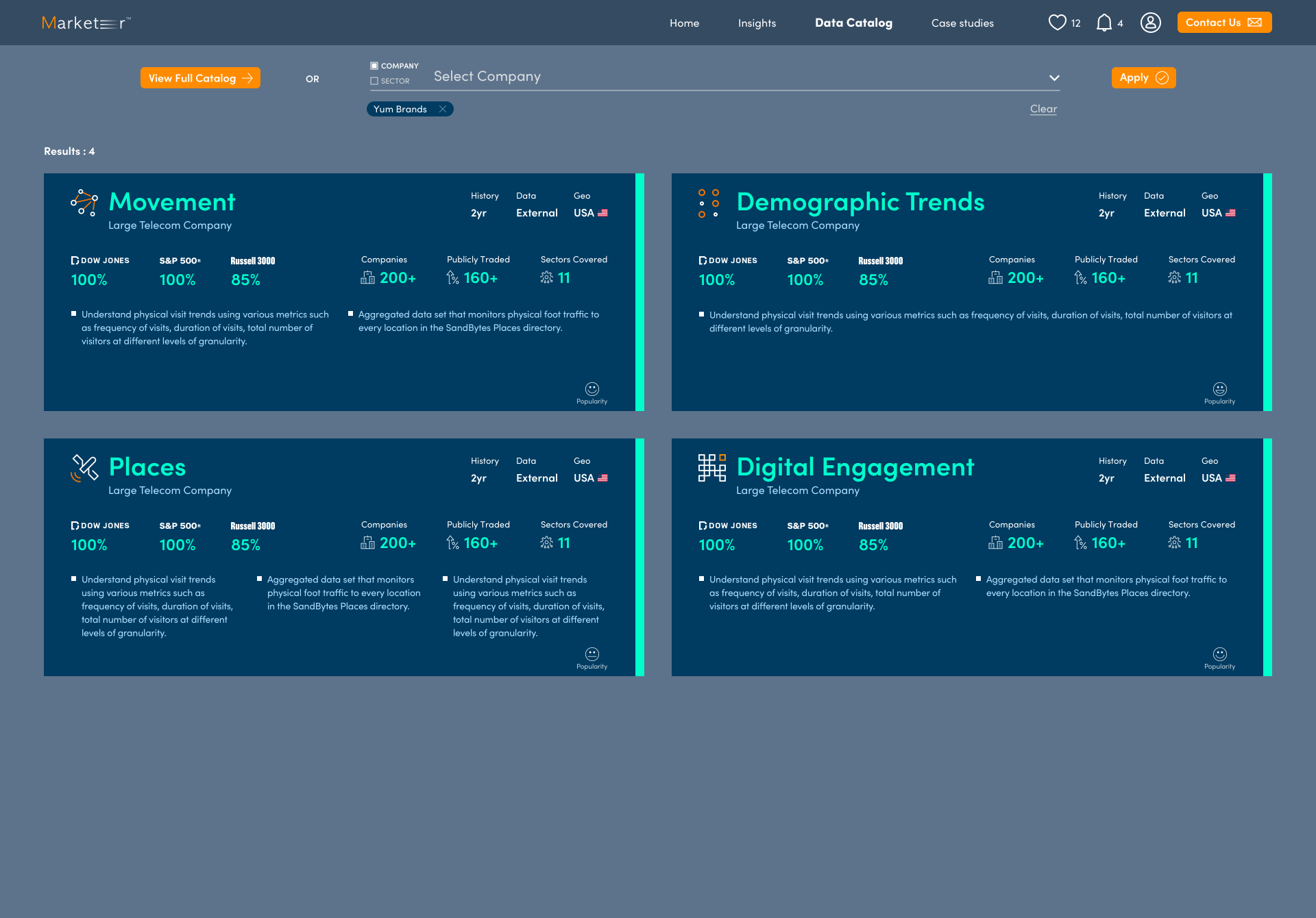
Slide title
Write your caption hereButton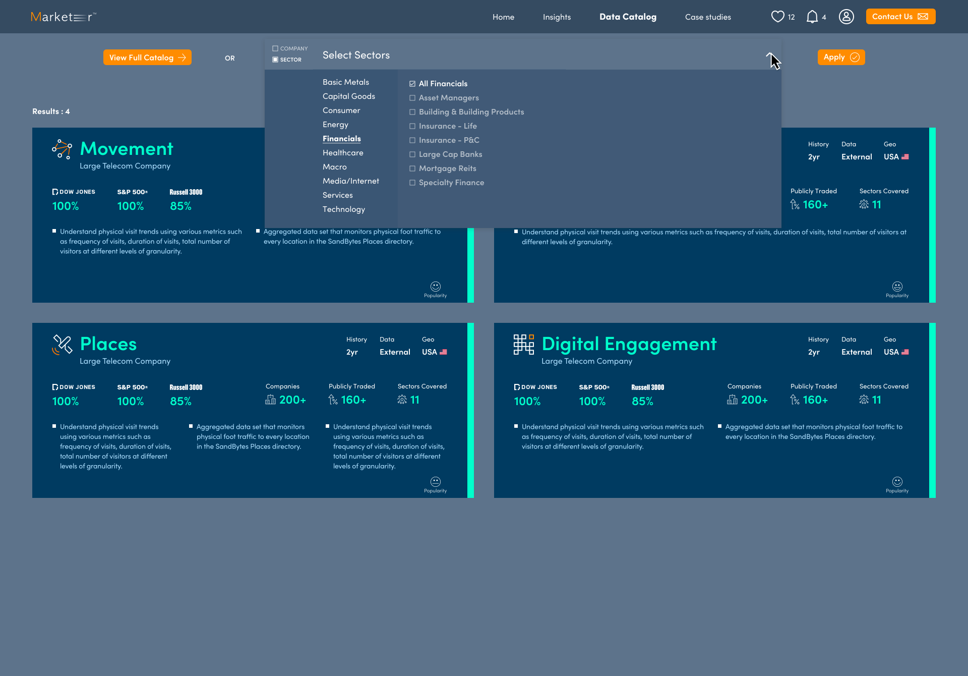
Slide title
Write your caption hereButton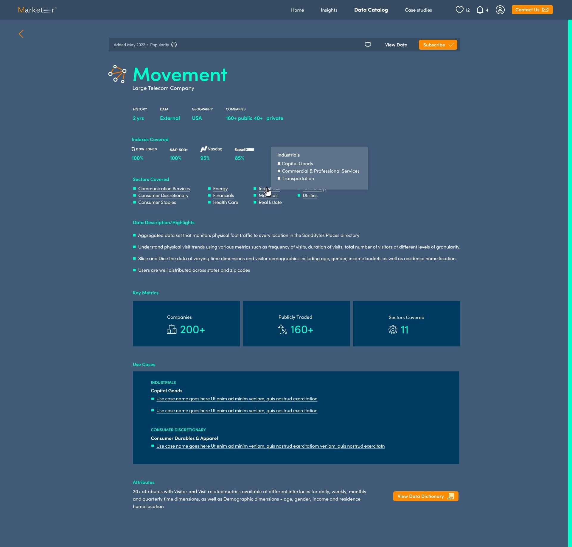 Write your caption hereButton
Slide title
Write your caption hereButton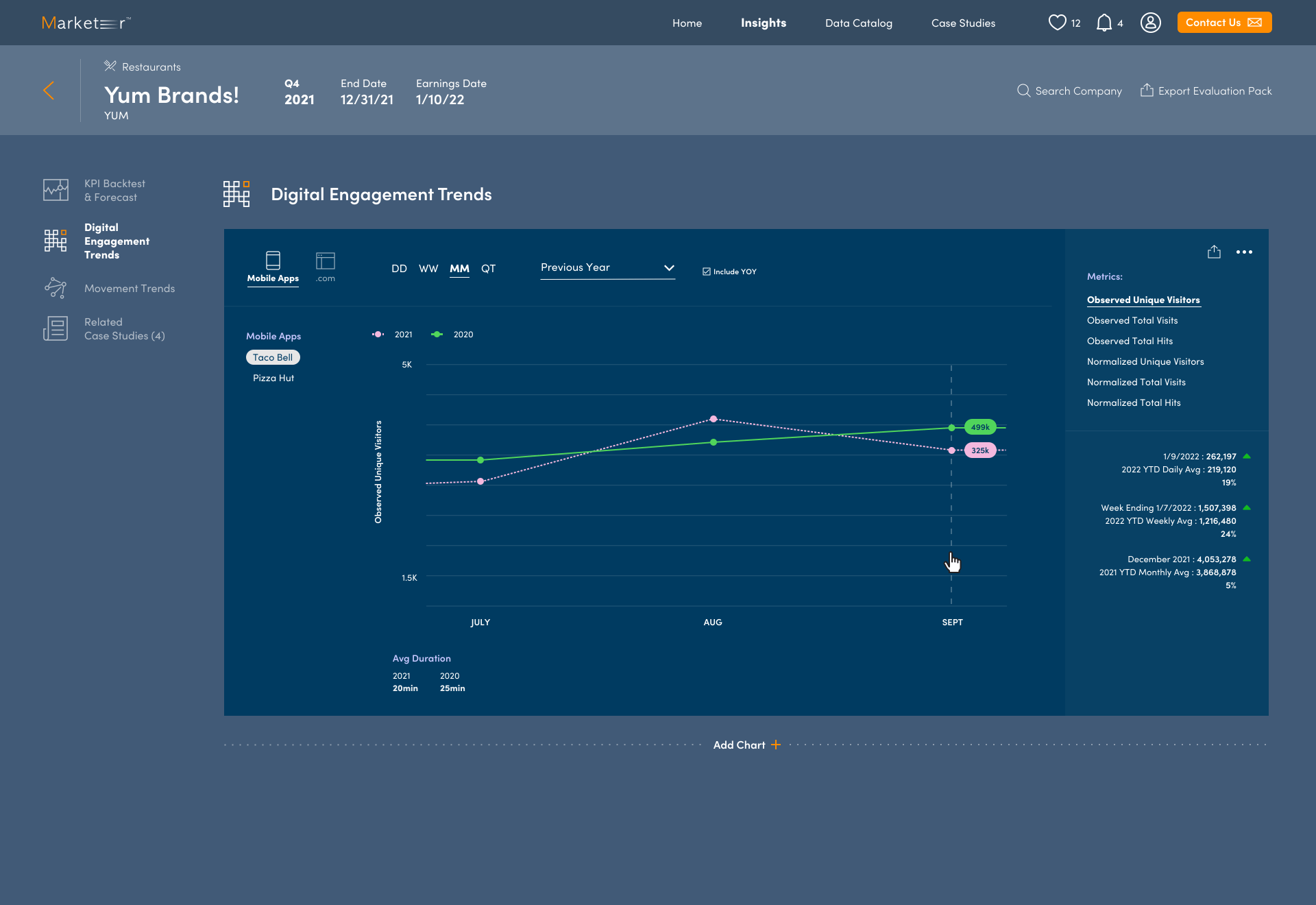
Slide title
Write your caption hereButton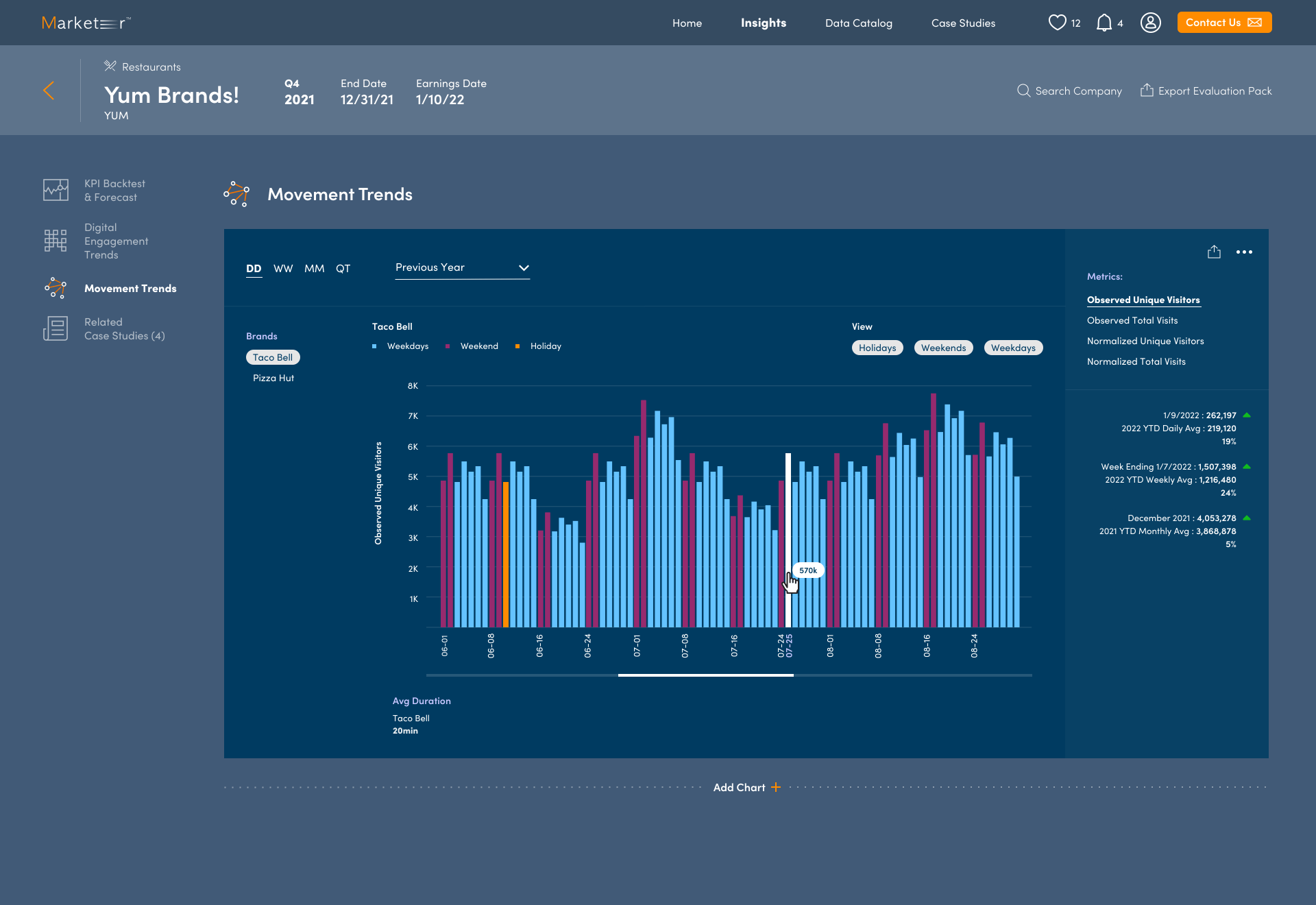
Slide title
Write your caption hereButton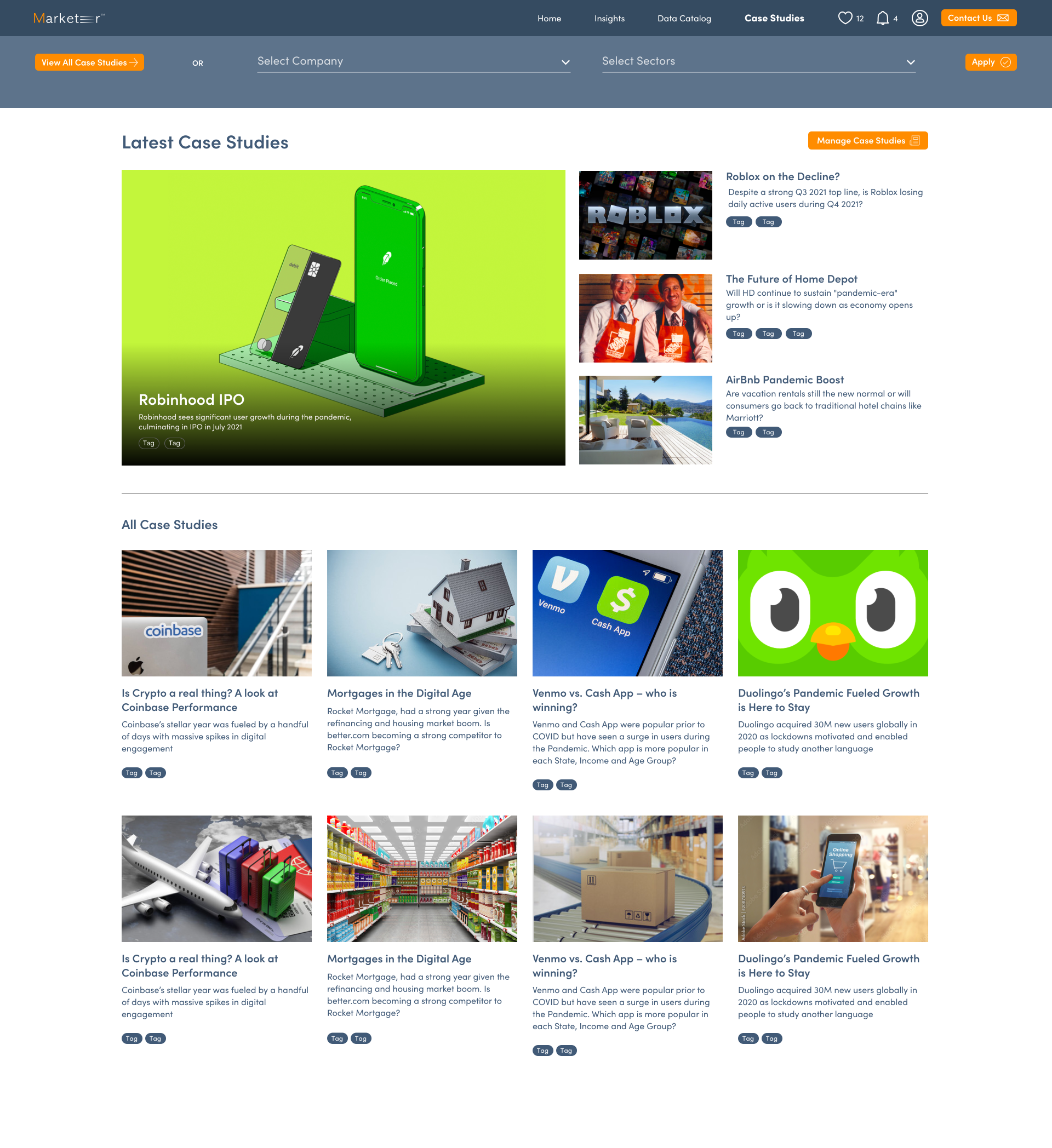
Slide title
Write your caption hereButton
